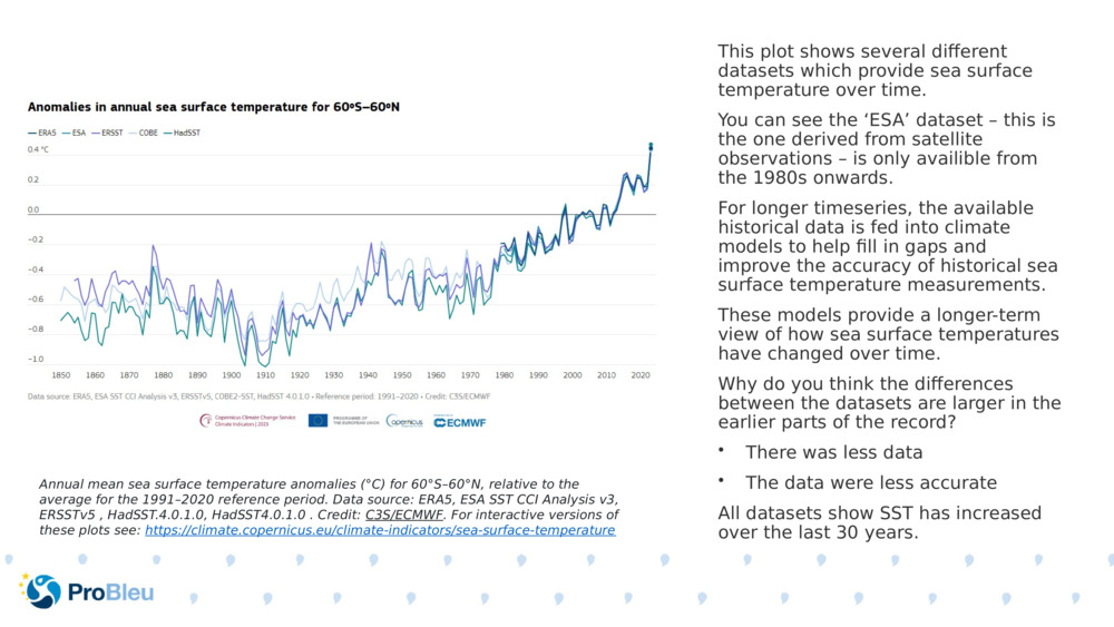
This plot shows several different datasets which provide sea surface temperature over time.
This plot shows several different datasets which provide sea surface temperature over time.
This plot shows several different datasets which provide sea surface temperature over time. You can see the ‘ESA’ dataset – this is the one derived from satellite observations – is only availible from the 1980s onwards. For longer timeseries, the available historical data is fed into climate models to help fill in gaps and improve the accuracy of historical sea surface temperature measurements. These models provide a longer-term view of how sea surface temperatures have changed over time. Why do you think the differences between the datasets are larger in the earlier parts of the record? There was less data The data were less accurate All datasets show SST has increased over the last 30 years. Annual mean sea surface temperature anomalies (°C) for 60°S–60°N, relative to the average for the 1991–2020 reference period. Data source: ERA5, ESA SST CCI Analysis v3, ERSSTv5 , HadSST.4.0.1.0, HadSST4.0.1.0 . Credit: C3S/ECMWF . For interactive versions of these plots see: https://climate.copernicus.eu/climate-indicators/sea-surface-temperature

Original Slide Deck: Measuring temperature from space
Topics: Ocean. Climate. Ocean Temperature.
Suitable Ages: 8. 9. 10. 11. 12. 13. 14. 15. 16.
Keywords: Climate. Satellite. Temperature.
Uploaded By: pml-admin
Number of bundles using this content: 2
Licensed under CC BY 4.0
This content has been used in the following resource bundles:
Measuring temperature from space
This resource bundle contains materials that describe how and why sea ...
View BundleMeasuring temperature from space
This resource bundle contains materials that describe how and why sea ...
View Bundle